Kiah Smith

Brand system & packaging for a holistic midwifery
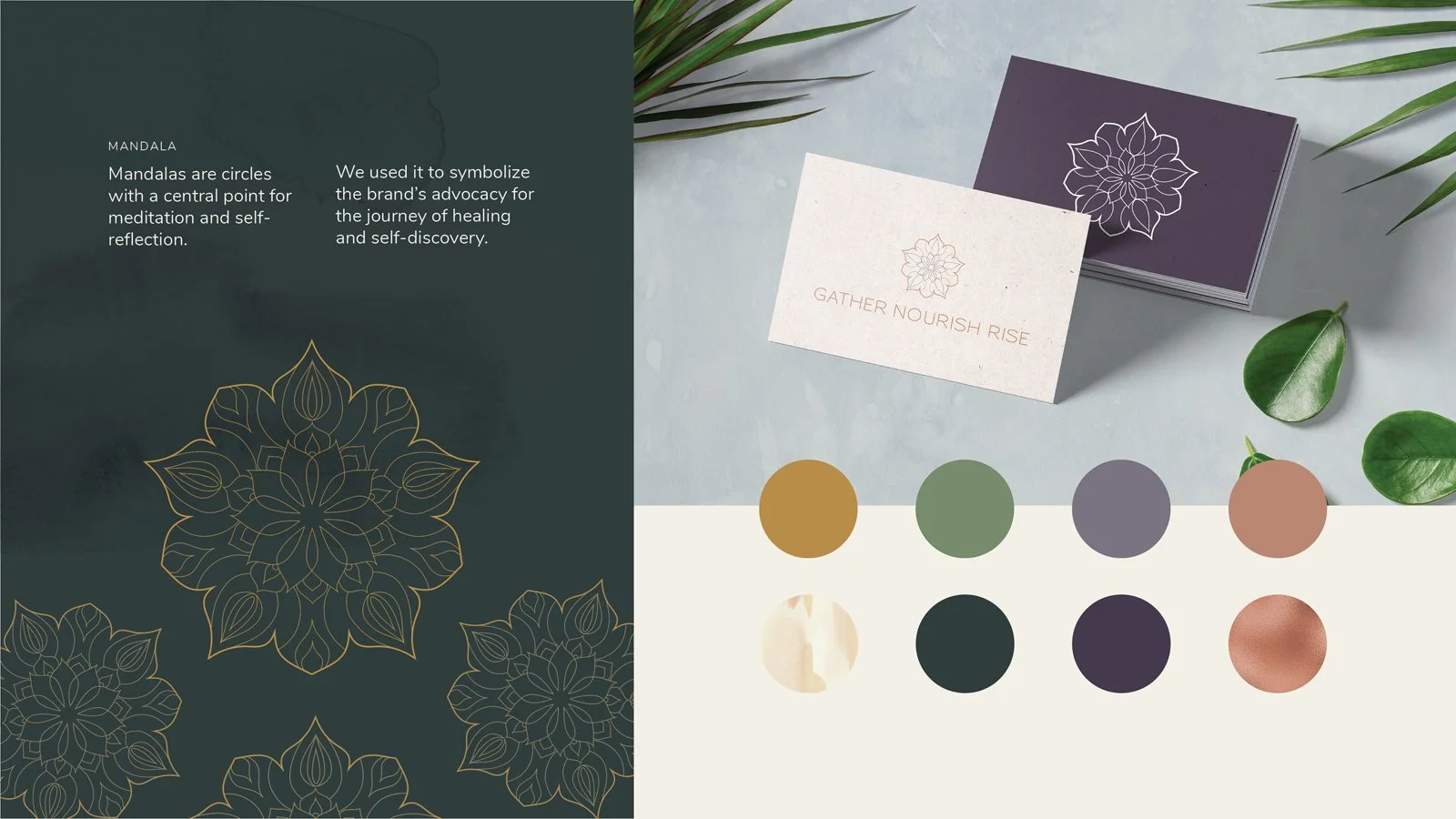
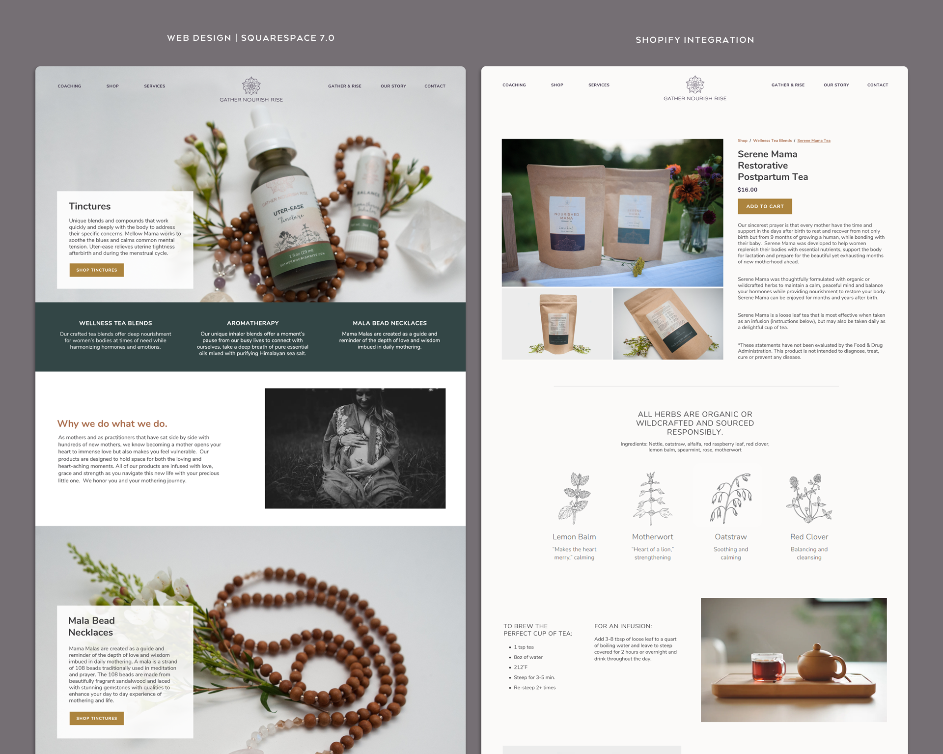
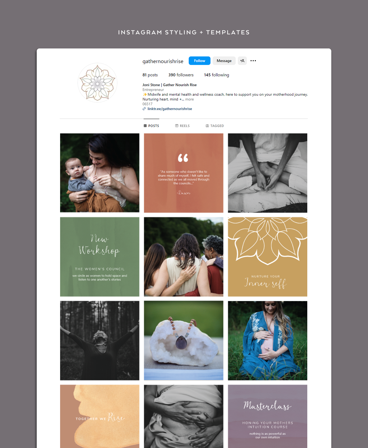
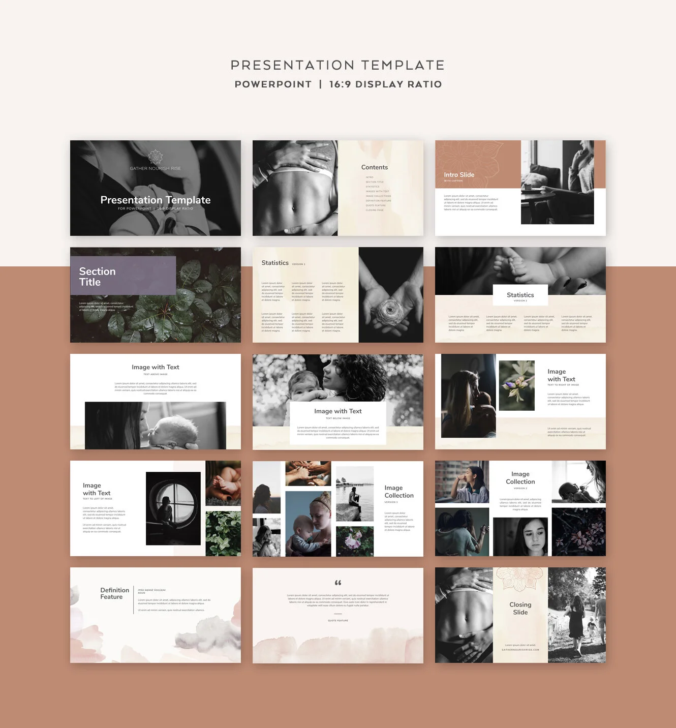
Gather Nourish Rise required a cohesive brand system that balanced clinical credibility with warmth and emotional resonance. I led the development of a structured visual identity, packaging system, and digital presence designed to clarify services, support educational content, and build trust across client touchpoints.


My Role:

  • Brand system strategy & visual identity development

  • Packaging architecture & production-ready design

  • Website structure & digital translation

  • Ongoing brand stewardship


Brand Strategy

The brand strategy centered on reframing motherhood with honesty rather than idealization. Acknowledging the physical and emotional complexities of birth and postpartum recovery, the identity communicates grounded strength and clinical credibility with compassion. Introspective imagery and earth-toned palettes establish a restrained visual language capable of handling a sensitive narrative with nuance and respect.

 
visual identity for gather nourish rise
 

The mandala was developed as a core visual motif, representing cycles of care, reflection, and growth. Its circular structure reinforces the brand’s emphasis on continuity, healing, and self-discovery, and appears consistently across print, packaging, and digital materials.

Packaging System Development

Packaging was developed across teas, tinctures, and inhalers, balancing regulatory requirements, production constraints, and shelf clarity while maintaining brand consistency.


Packaging:
Loose Leaf Tea Blends

These blends required packaging that highlighted key natural ingredients. Each product emphasized the primary botanicals used in the blend through artwork and educational blurbs.

The Challenge

The original design concept relied on a full-wrap gusset print, but achieving the desired material quality and finish pushed production costs beyond budget constraints.

The Solution

I restructured the design into a modular single-label system applied to kraft packaging to reduce production costs. Foil accents preserved a premium feel while allowing the line to extend easily across additional SKUs.


PAckaging: Tinctures

These tinctures required packaging that communicated care and reassurance while remaining compliant with FDA cosmetic and wellness regulations. The design needed to balance clarity, trust, and restraint.

The Challenge

The tinctures are regulated as cosmetic wellness products rather than pharmaceuticals, requiring careful control of language to avoid implied medical claims.

The Solution

The label design and supporting copy emphasized gentle wellness, ingredient transparency, and usage guidance without referencing treatment or diagnosis to remain compliant.

Digital Presence

The digital presence was designed to balance autonomy and scalability. The primary site was built on Squarespace to support service-based content and client-led updates, while e-commerce was handled through Shopify and integrated seamlessly into the experience to support product sales without fragmenting the brand.

squarespace web design with shopify integration.png

Brand in Practice

To support launch and ongoing promotion, I developed brand execution assets including Instagram templates, a launch-focused story and post sequence, and a presentation template for workshops and client-facing materials. I also collaborated with the founder on initial copywriting to establish tone and messaging at launch.

Photos courtesy of Rachel Liu.

instagram styling and template design