Iannucci Spirits
Overview
Iannucci Spirits is a family-owned micro brewery, making wine and cider. I designed a series of labels for their two brands, Valor Wines and Apple Theory Cidery. Each project required its own identity and label systems that could be adapted for a growing product line.
My Role
Logo Design
Label System Design
Regulatory Layout
Creating a logo rooted in tradition for Valor Wines
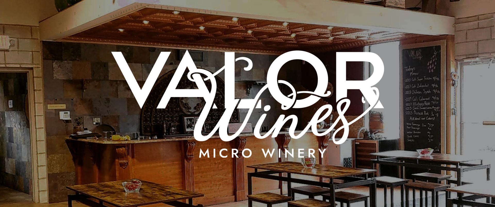
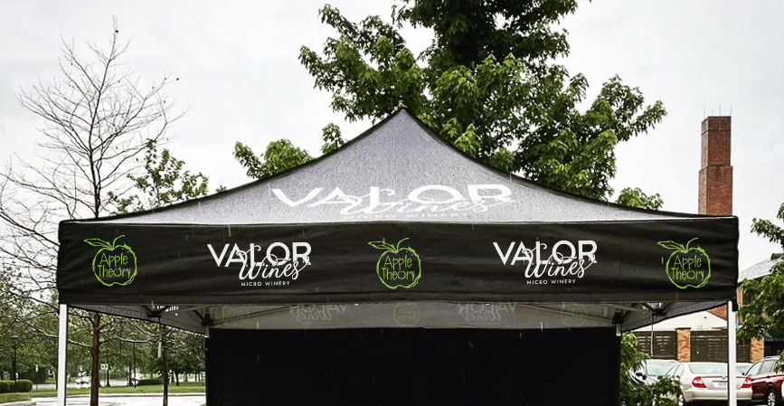
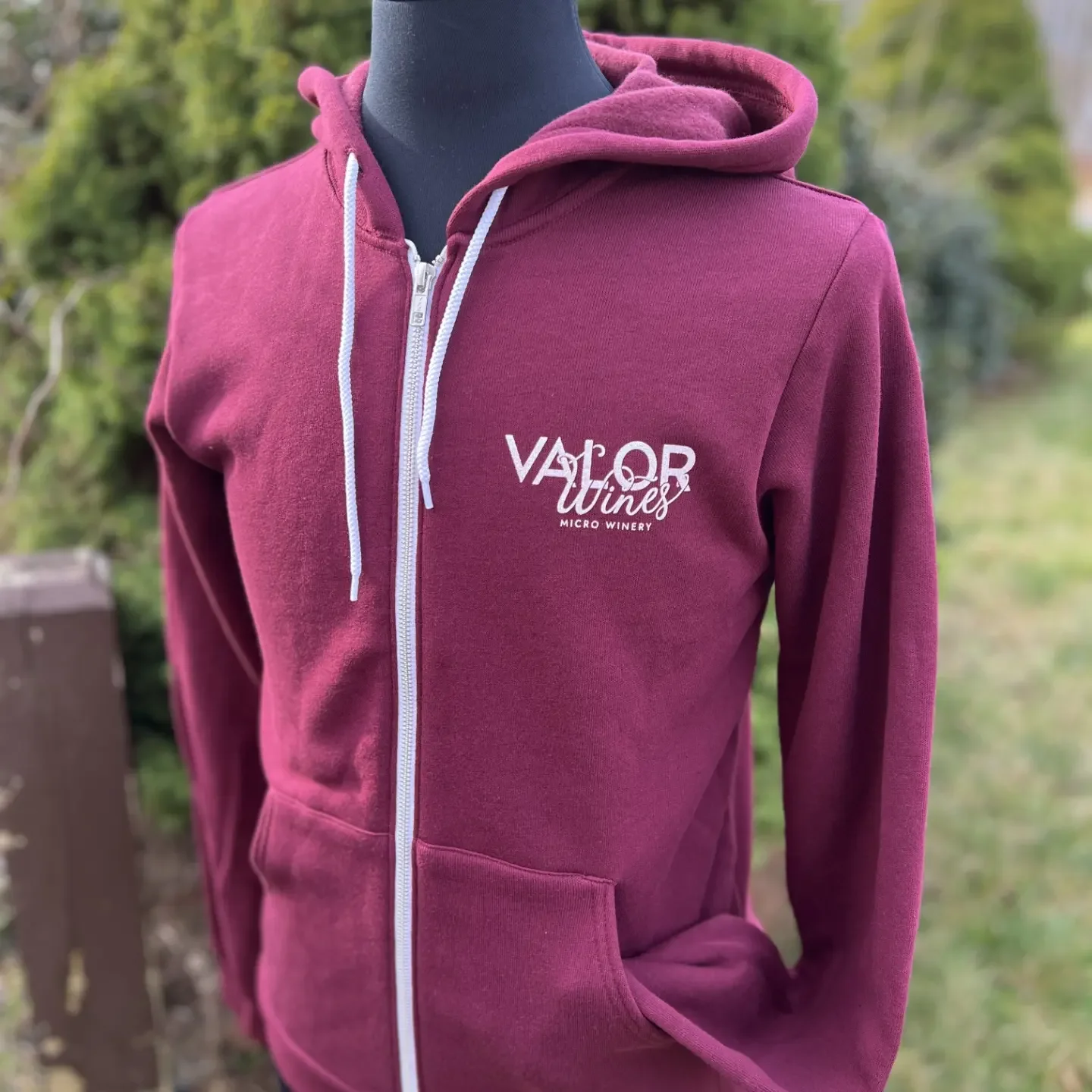
Valor Wines is a brewery with generations of experience in winemaking. They came to me for a refresh as a new generation took ownership. The challenge was to design a logo that honored the brand’s traditional roots, while adding a modern touch. I accomplished this with custom lettering, intertwining the typography to show fusion of new and old.
Photos by: @valorwines
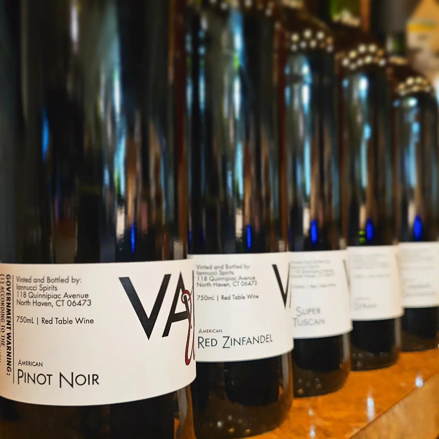
Creating a label system for a developing product line
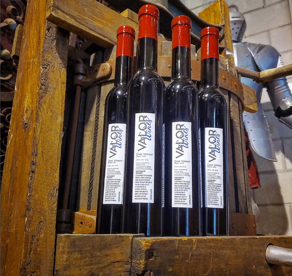
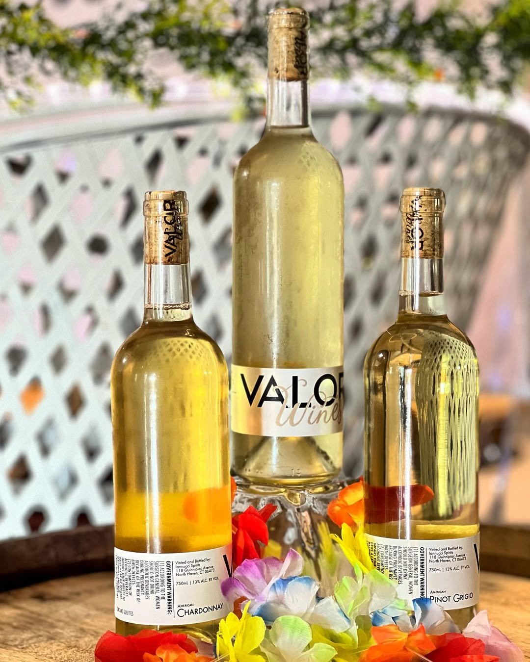
Valor Wines has a large line of brews that updates seasonally. I created a label system that could be updated with each new release and maintain a consistent brand identity. This label system has grown with them, accommodating everything from traditional offerings through specialty releases.


Creating an identity for an ambitious hard cider brand
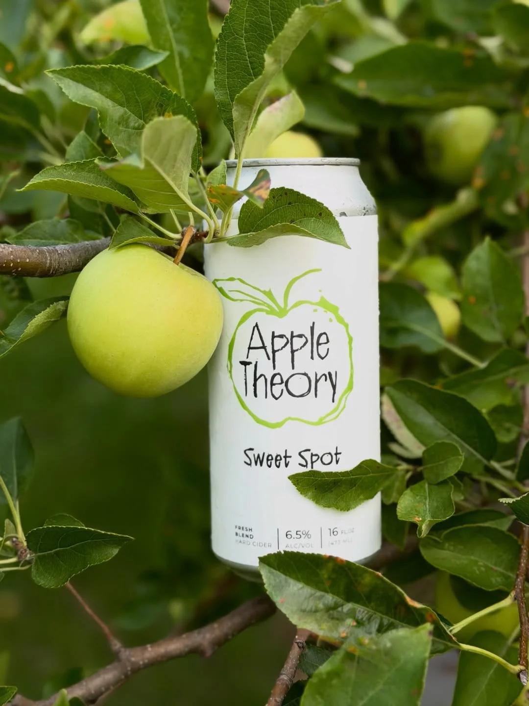
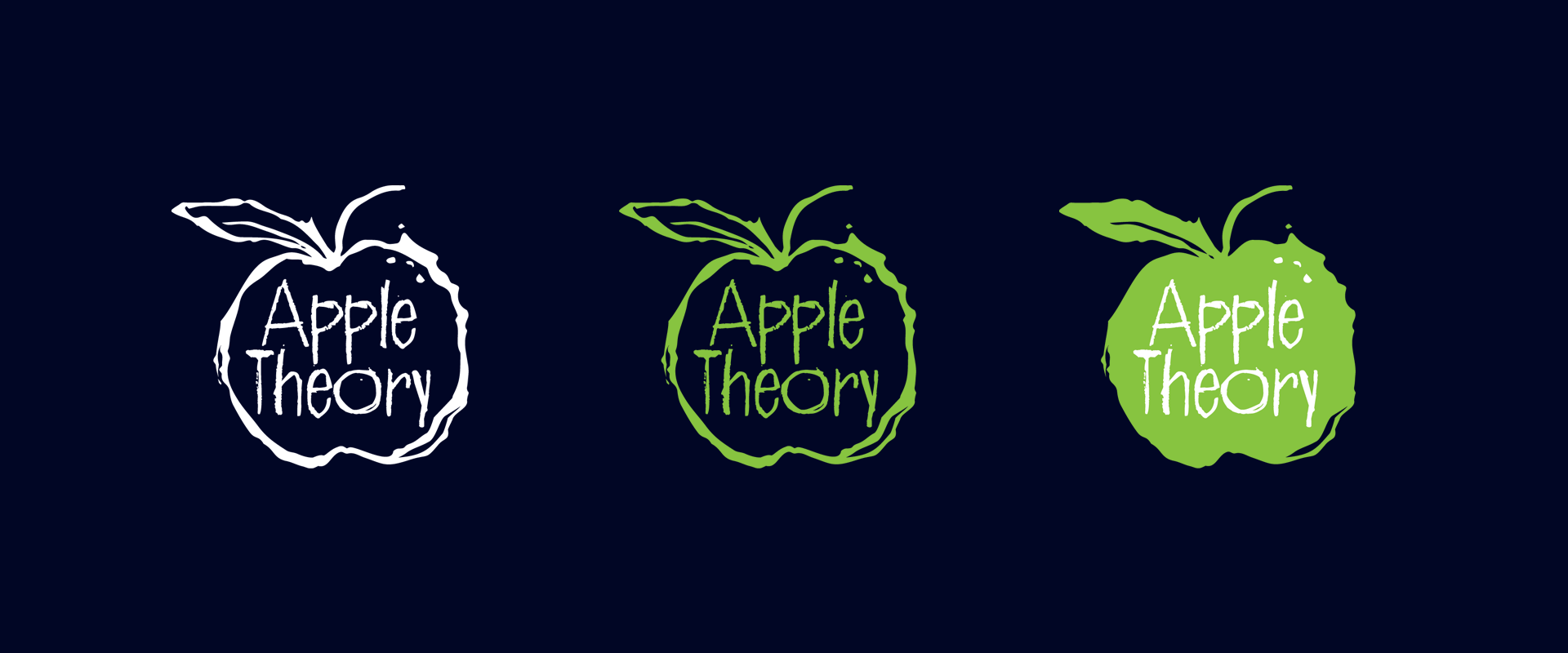
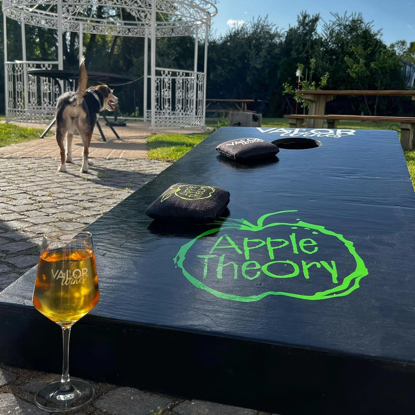
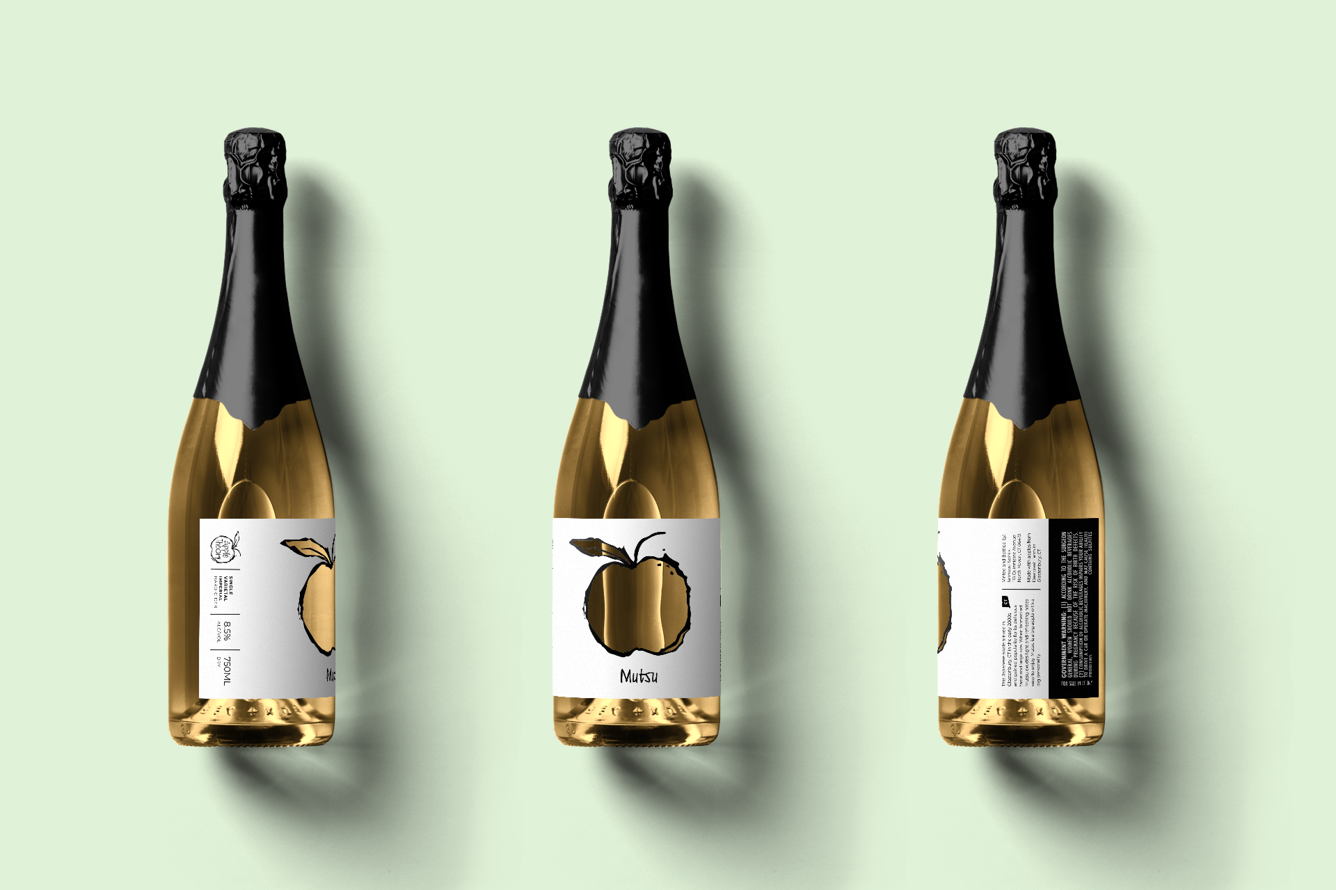
When Iannucci Spirits expanded into hard cider, I developed a new visual identity for their new Apple Theory brand. The direction for their logo design was to create an identity that had grit and grunge. This direction set Apple Theory apart from Valor Wines as its own creation under the Iannucci Spirits umbrella.
Photos by: @appletheorycidery
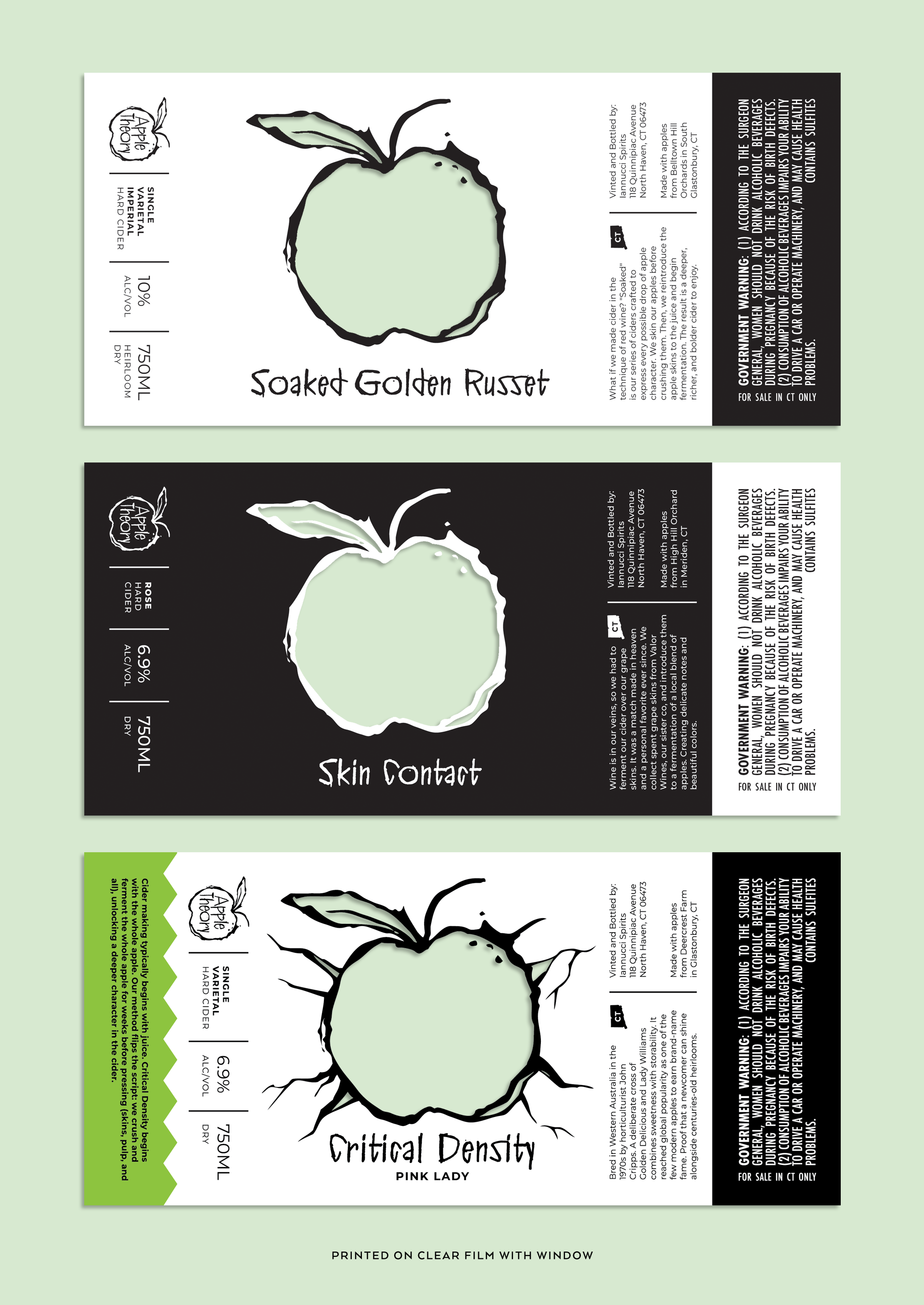
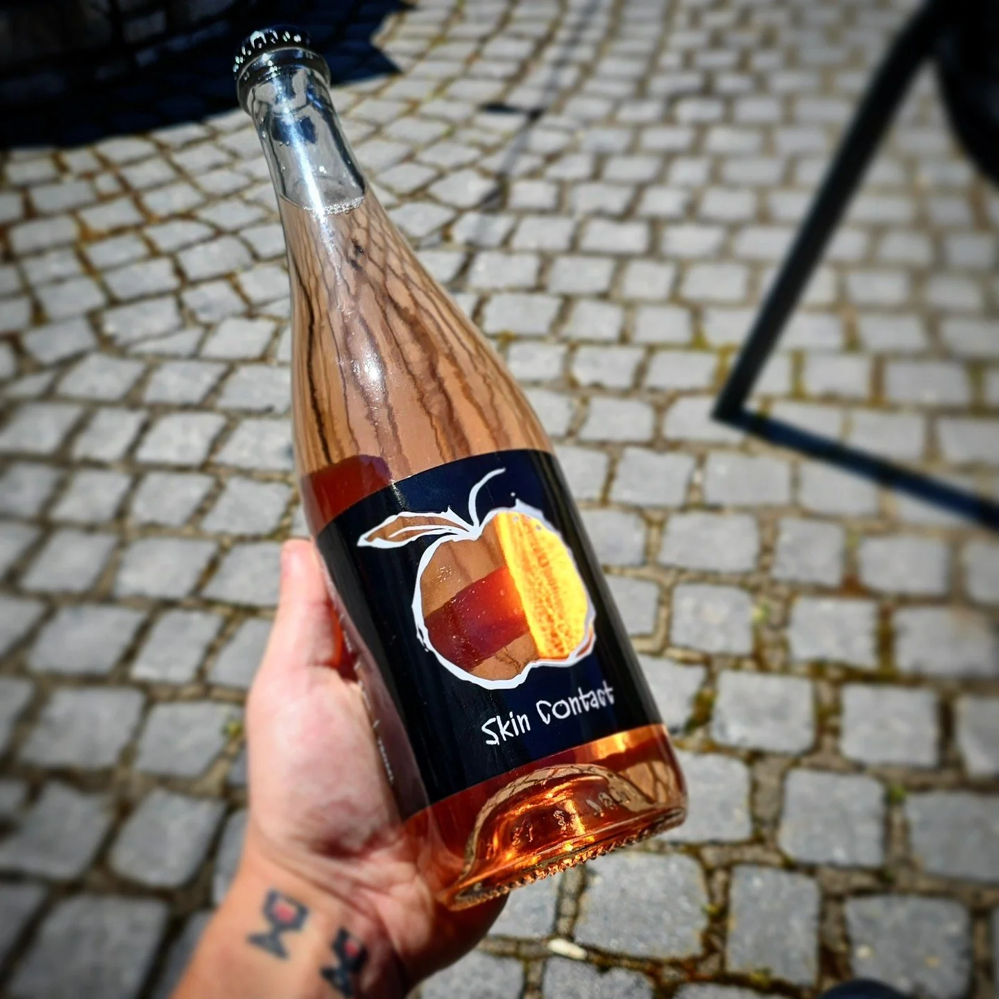
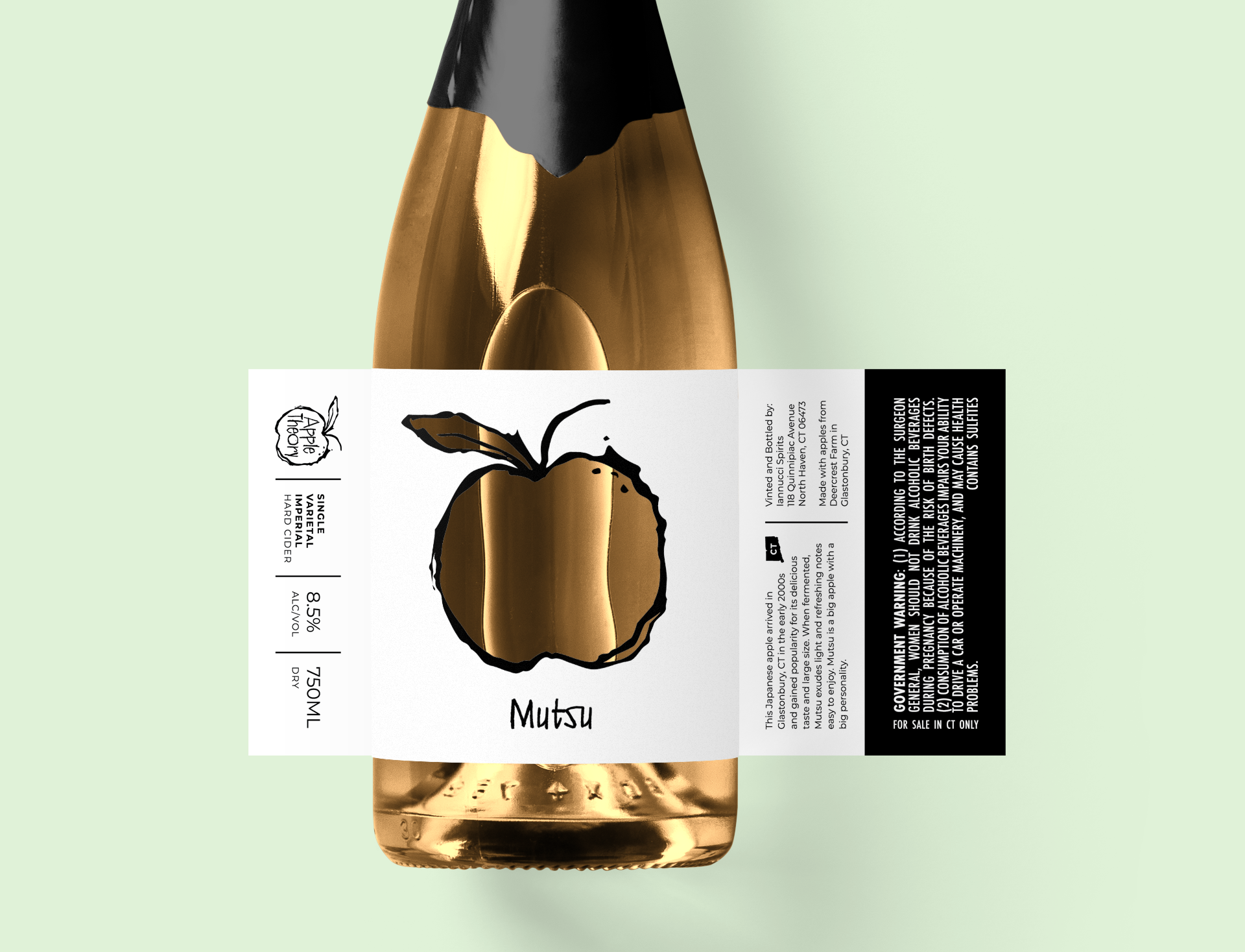
Developing a label system that blended old and new
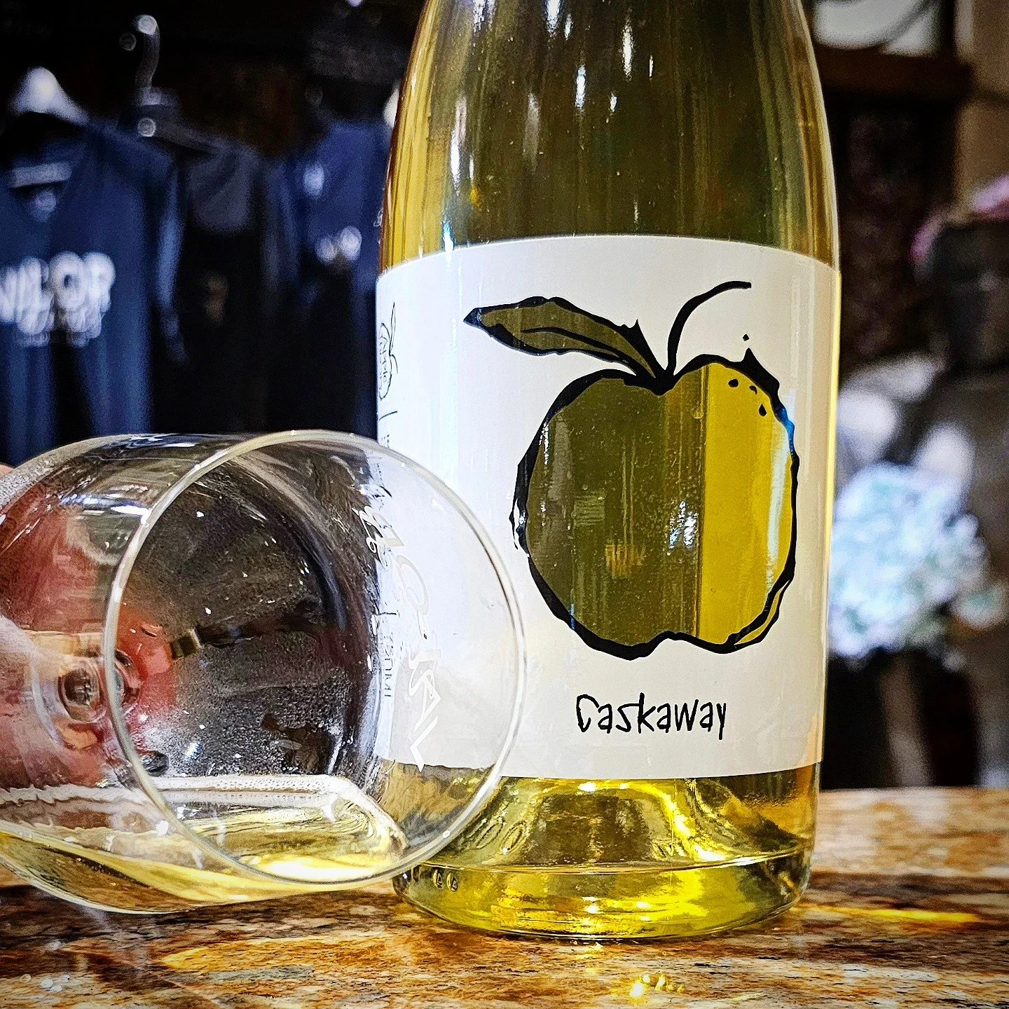
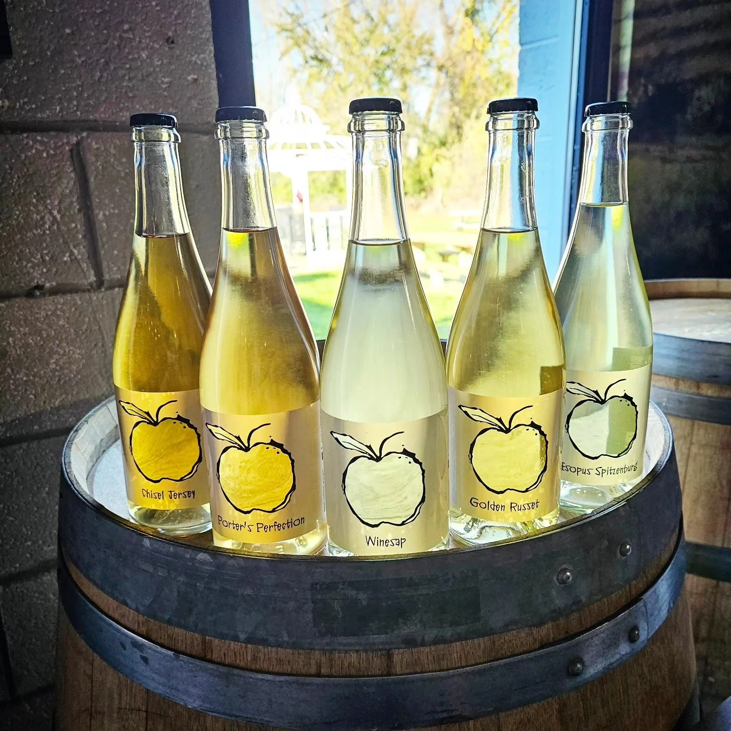
With the logo complete, we moved on to the packaging design. I created a new label system adapted from Valor Wines and refined for the style of cider. The labels were printed on film with a window that showcased the product and highlighted the apple varieties used in each cider.
Photos by: @appletheorycidery
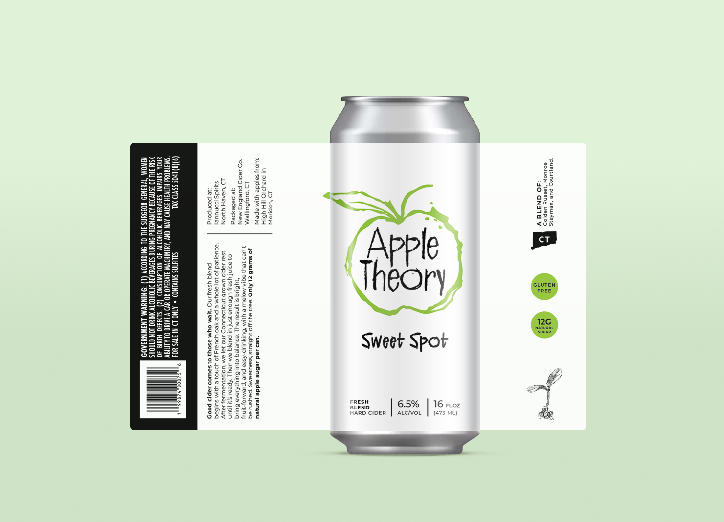
Adding canned drinks to the Apple Theory system
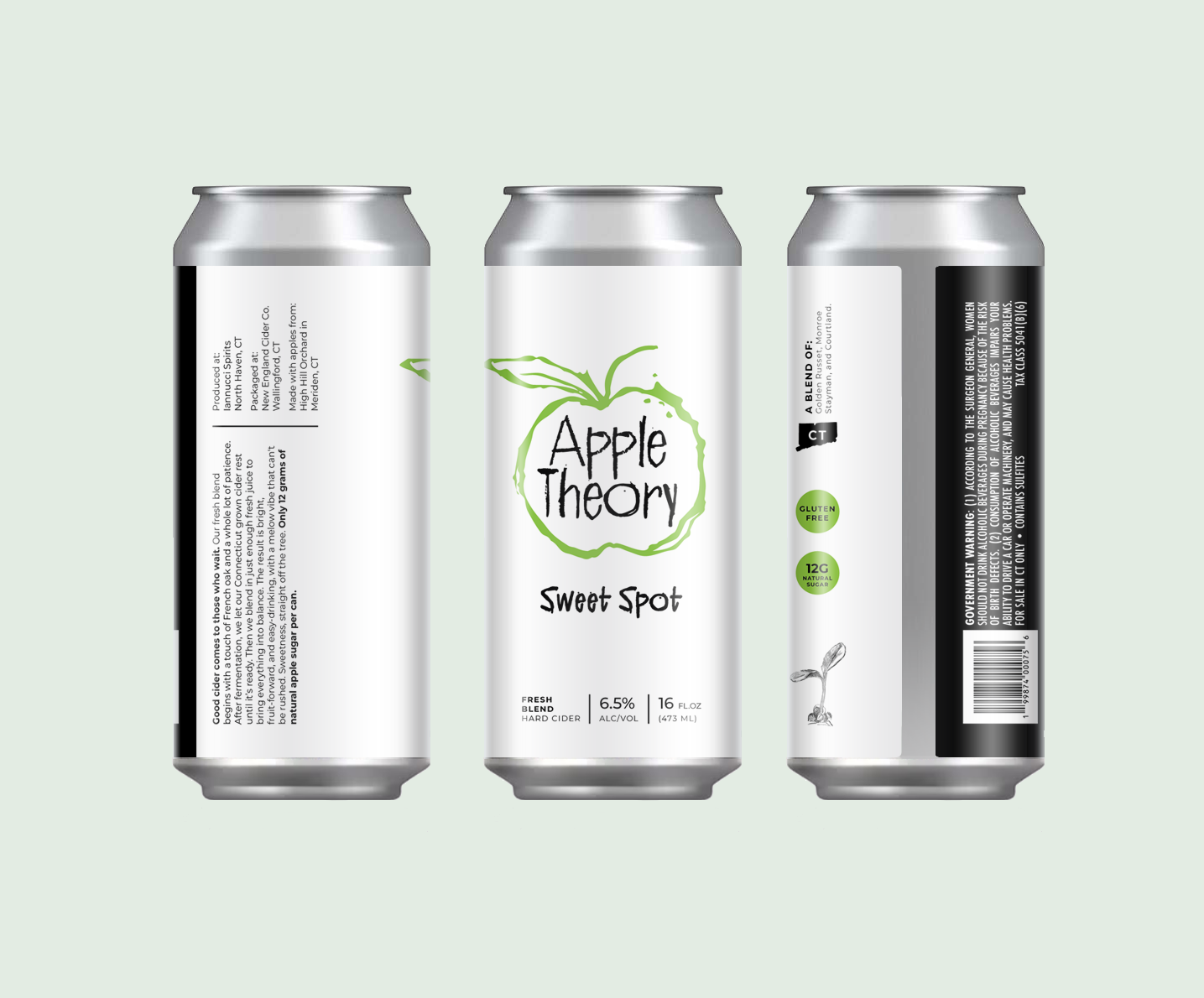
As Apple Theory grew, canned drinks were added to the product line. The challenge was to keep the design close to the original bottle label while working with the opaque surface of the can and the new label dimensions. After exploring several approaches, I landed on a design that complemented the original template.
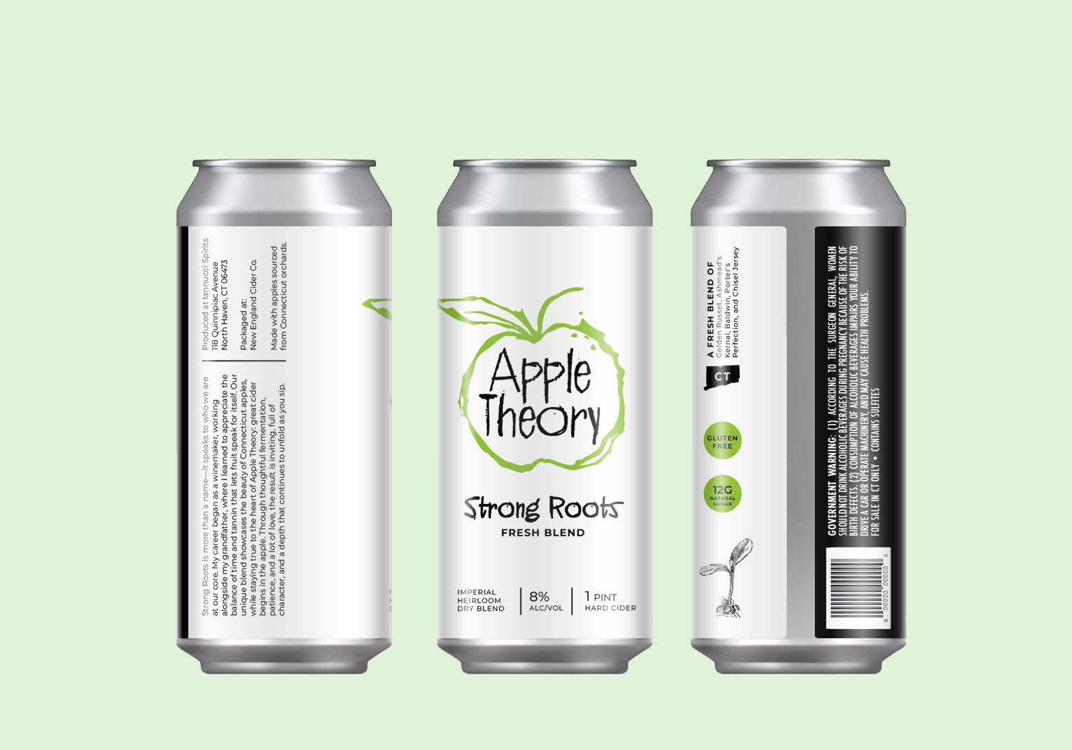
Design Explorations
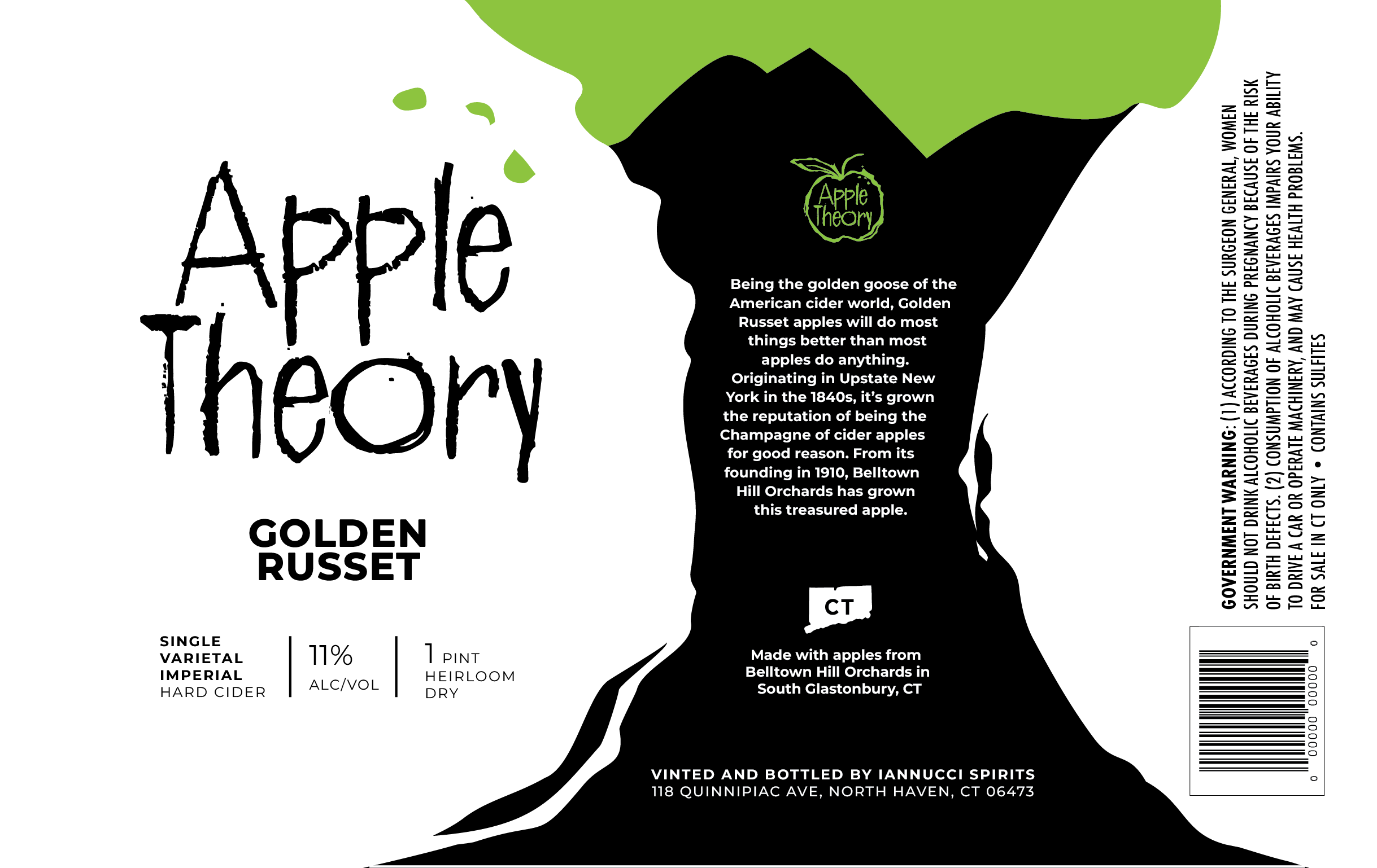
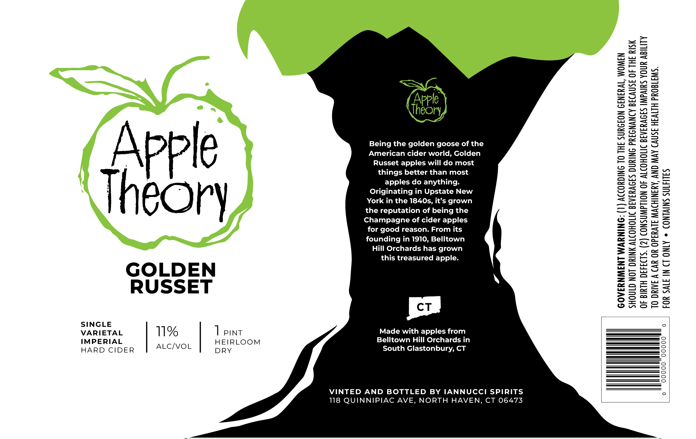
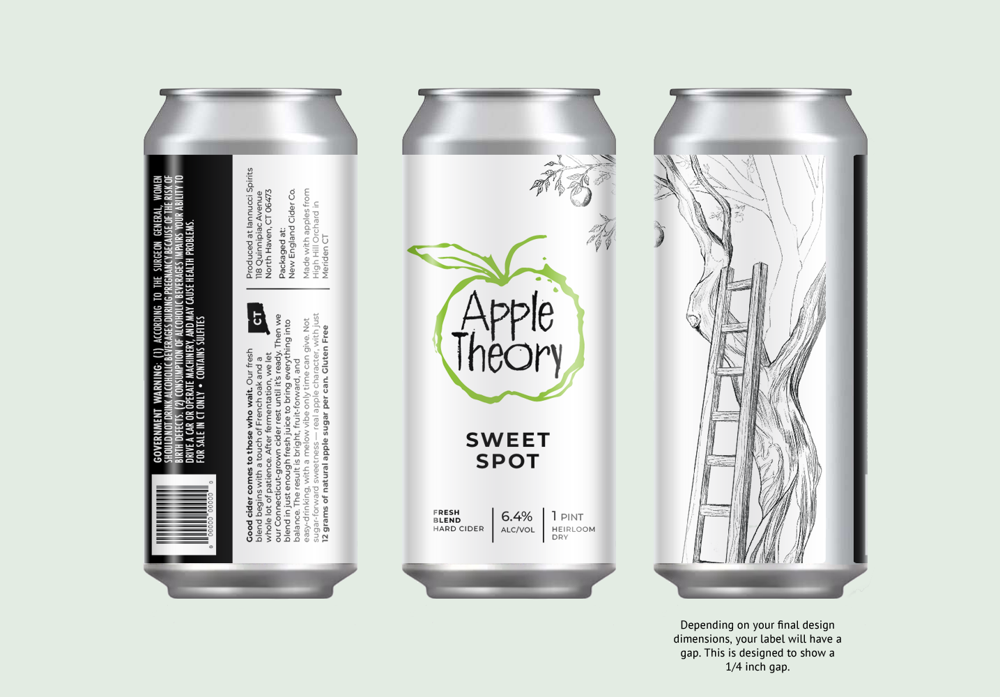
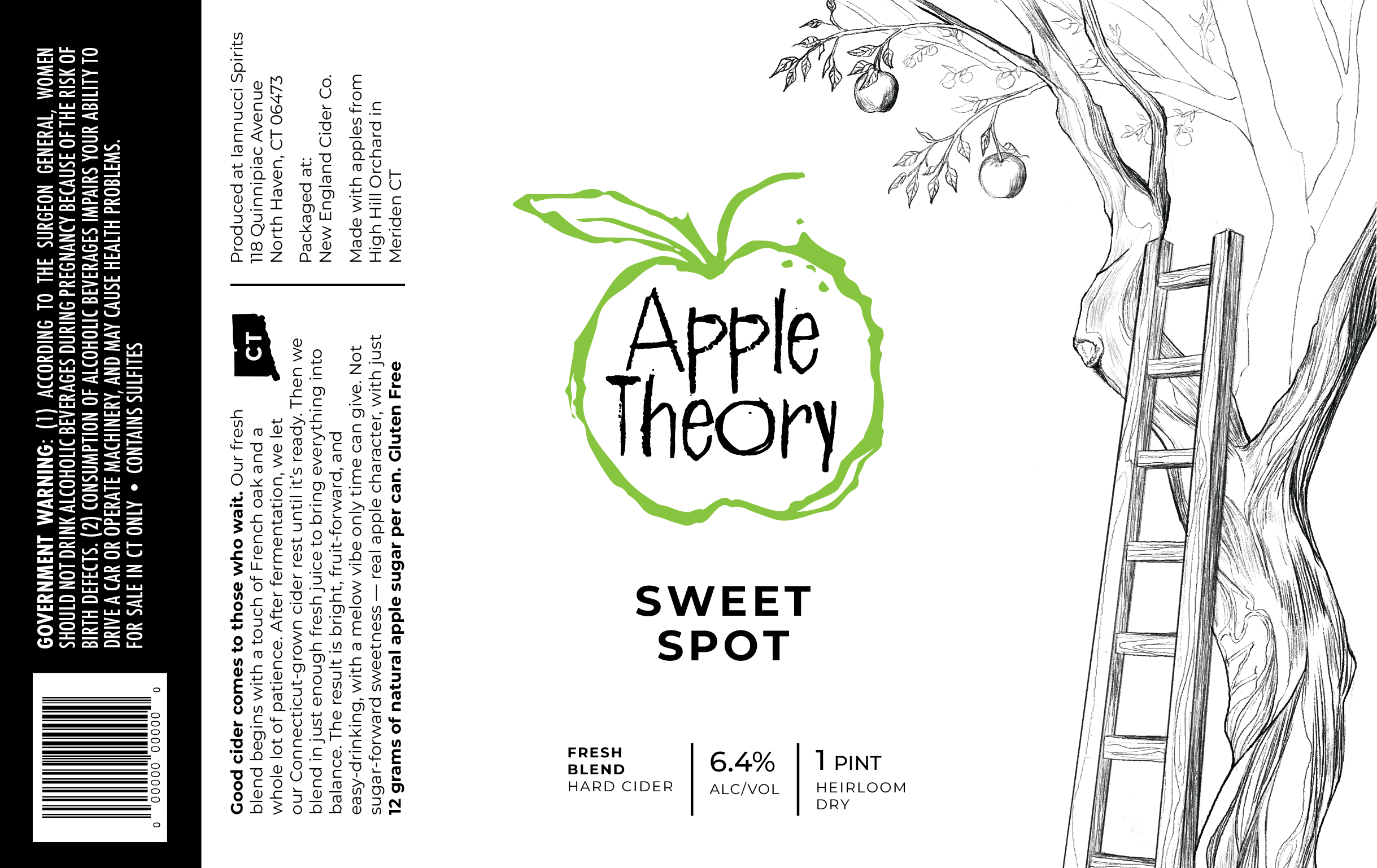
These are some of the visual directions I explored, testing different art styles and layouts.
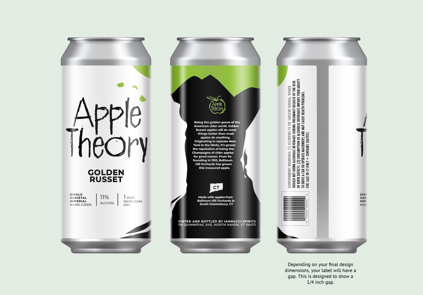
The final Design
The final design landed close to the original label system. A small sprout illustration was added to hint at more to come as this new product line continues to grow.