Virginia Tech • College of Science
Web Design for the
Department of Economics
Virginia Tech
College of Science
Web Design for the
Department of Economics
Overview
I redesigned the undergraduate website for Virginia Tech’s Department of Economics, reorganizing academic information and student resources into an easier-to-navigate experience for prospective and current students.
Project Team:
Samantha Hannah, Director of Undergraduate Recruiting
Teresa DeCarmen, Assistant Director Design & Digital Strategy
My role
UX / Information Architecture
Visual & Web Design
CMS Implementation
Reshaping a scattered experience
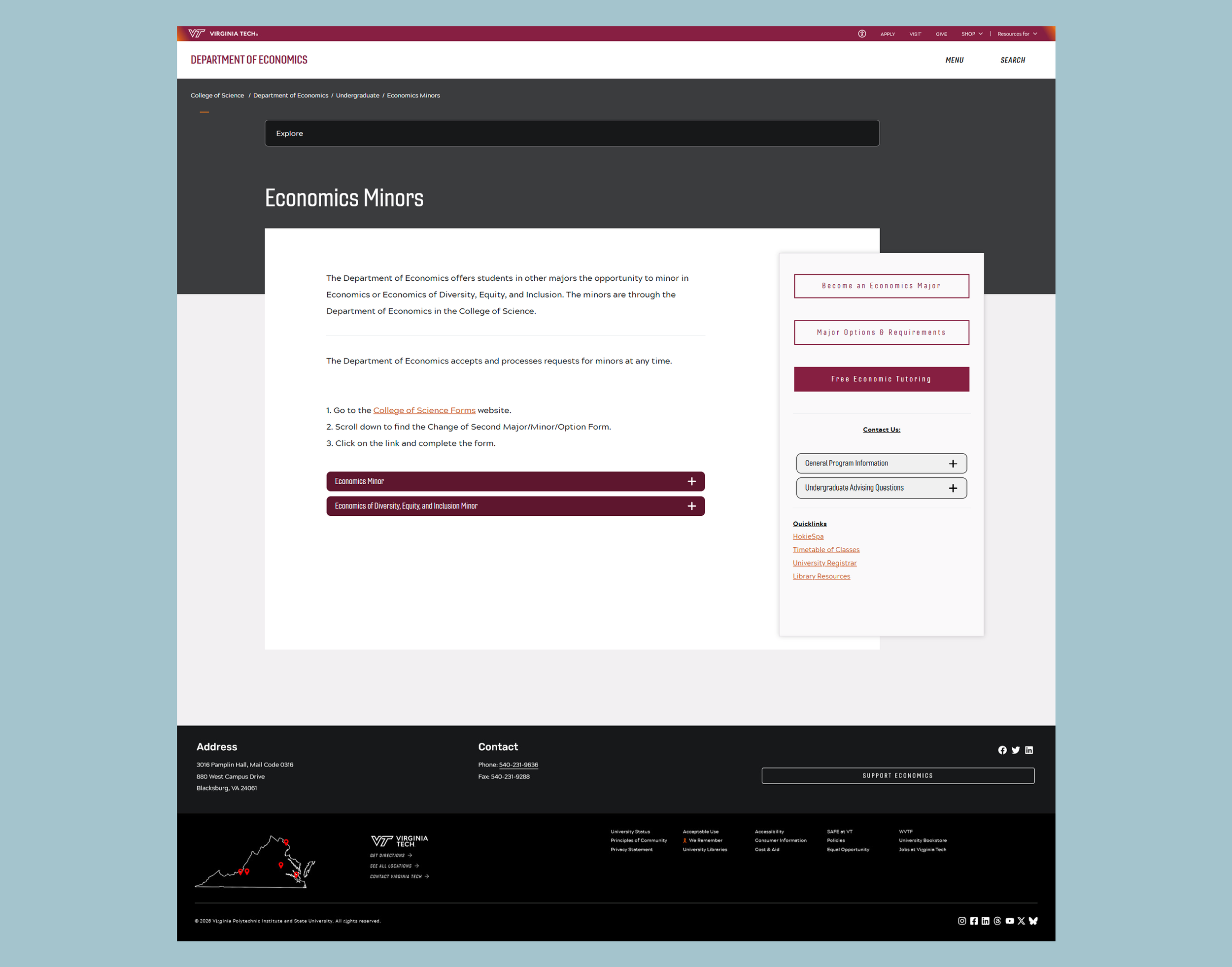
On the original site, key undergraduate resources were distributed across disconnected pages. Limited visual hierarchy made information difficult to scan and navigate.
The guiding approach for this project became:
How might we help students find degree options and resources more efficiently?
Together, Samantha and I identified opportunities to reorganize the site's content and create clearer pathways to the information students needed most.
The plan
My goal was to help students reach key information within 1-2 clicks. To do this, I restructured the landing page as a hub, organizing the content and adding clear call to actions throughout the page.
The Challenge
The redesign had to work within Virginia Tech's existing CMS, which uses prebuilt components with limitations on styling and functionality. The designs also needed to align with the university's brand, meet accessibility requirements, and minimize custom code to simplify maintenance by department staff.
Original lAnding Pages
Creating a landing page with a clear information hierarchy
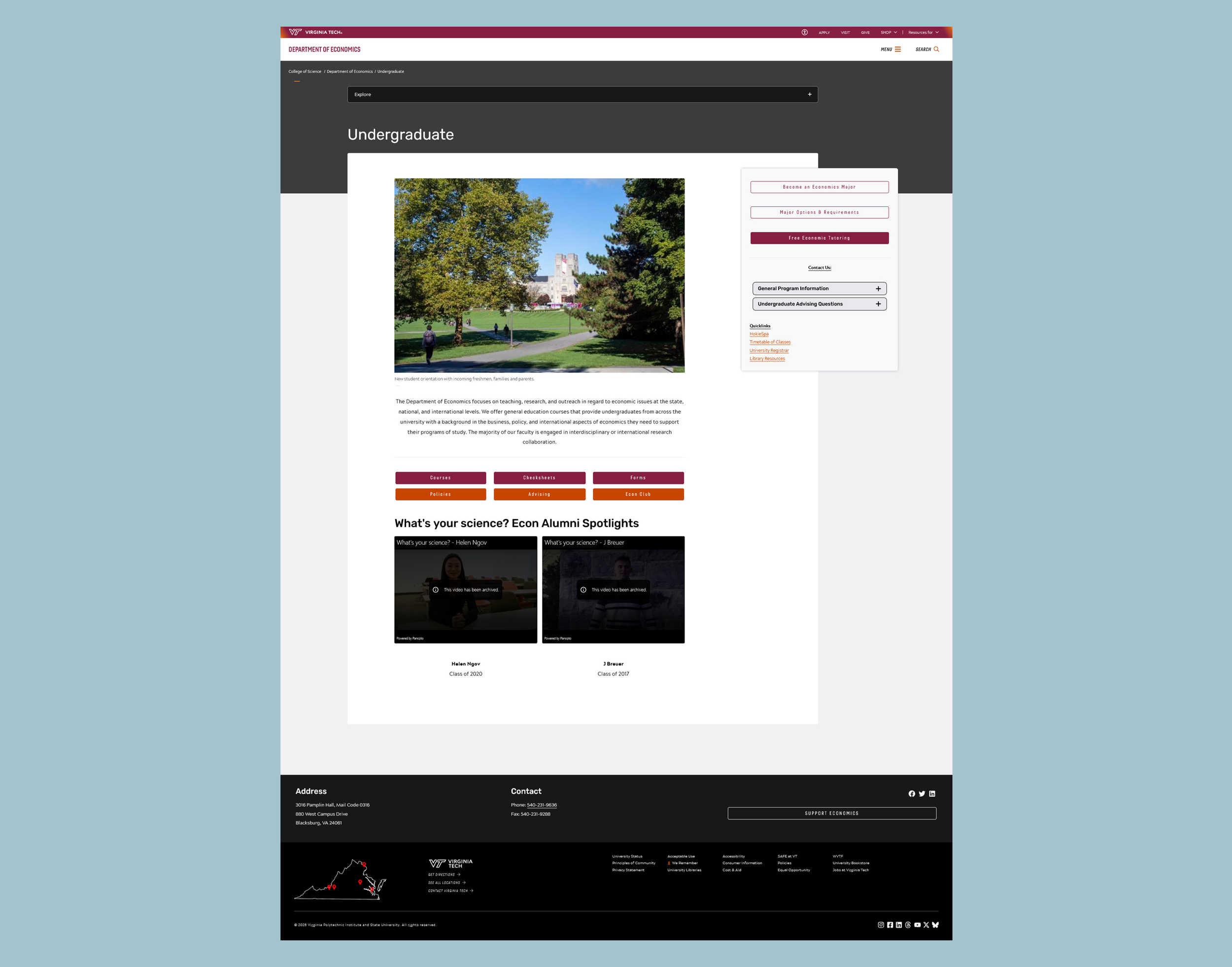
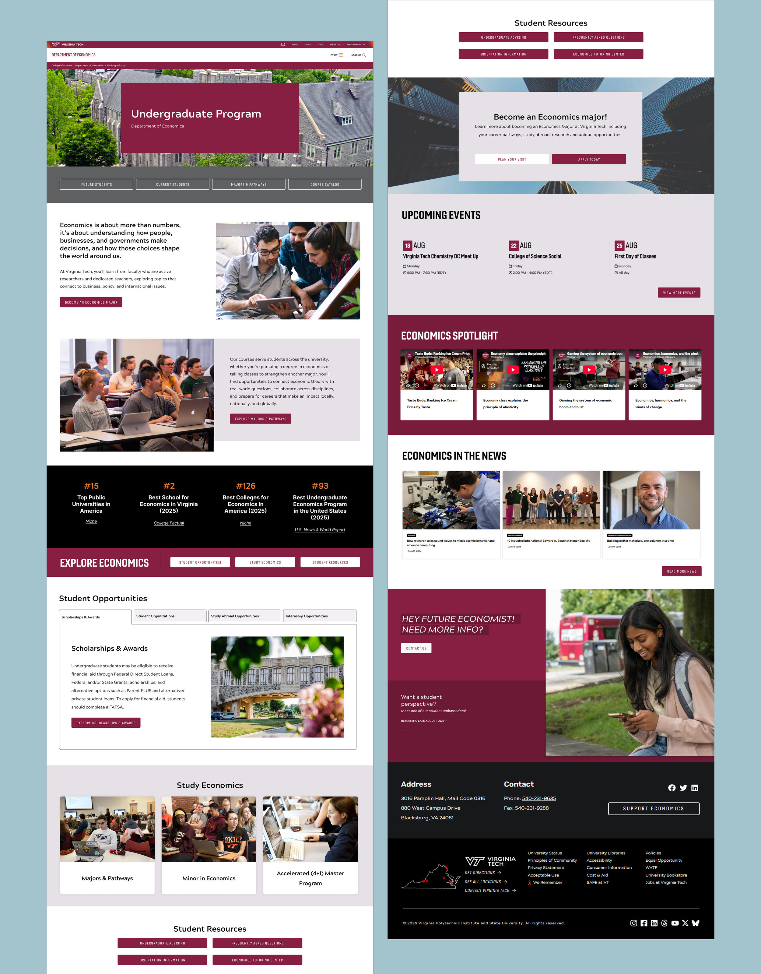
I reorganized the landing page into clearly defined sections, prioritizing degree options for prospective students. Prominent CTAs throughout the page directed visitors to the new Majors & Pathways page, while a dedicated hero navigation section provided direct links to key resources.
I created an "Explore Economics" section that consolidated information previously scattered across the site. Organizing resources into clearly defined groups gave each topic appropriate prominence and established the landing page as a central hub for prospective and current students.
The redesigned landing page
Highlighting majors and pathways for prospective students
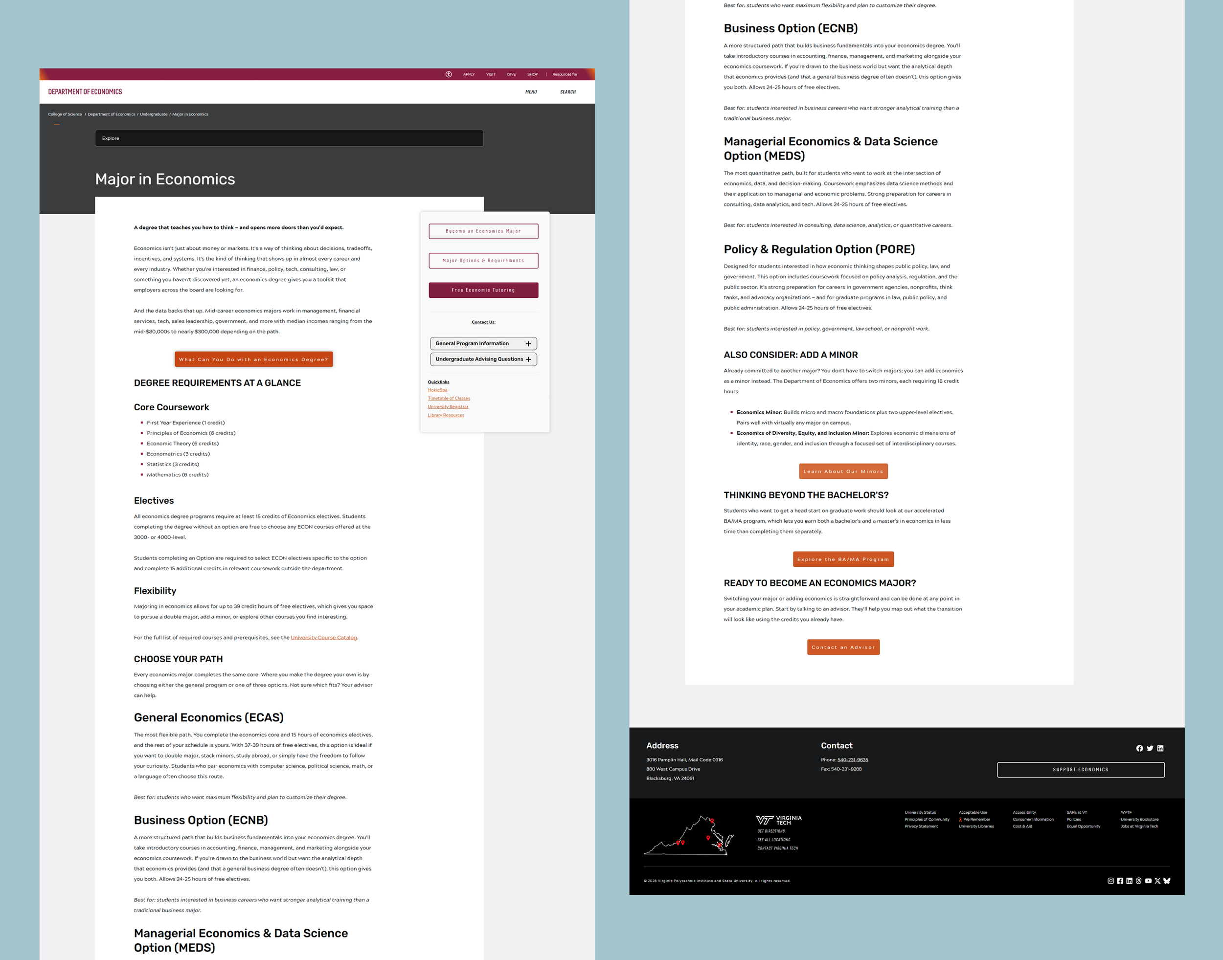
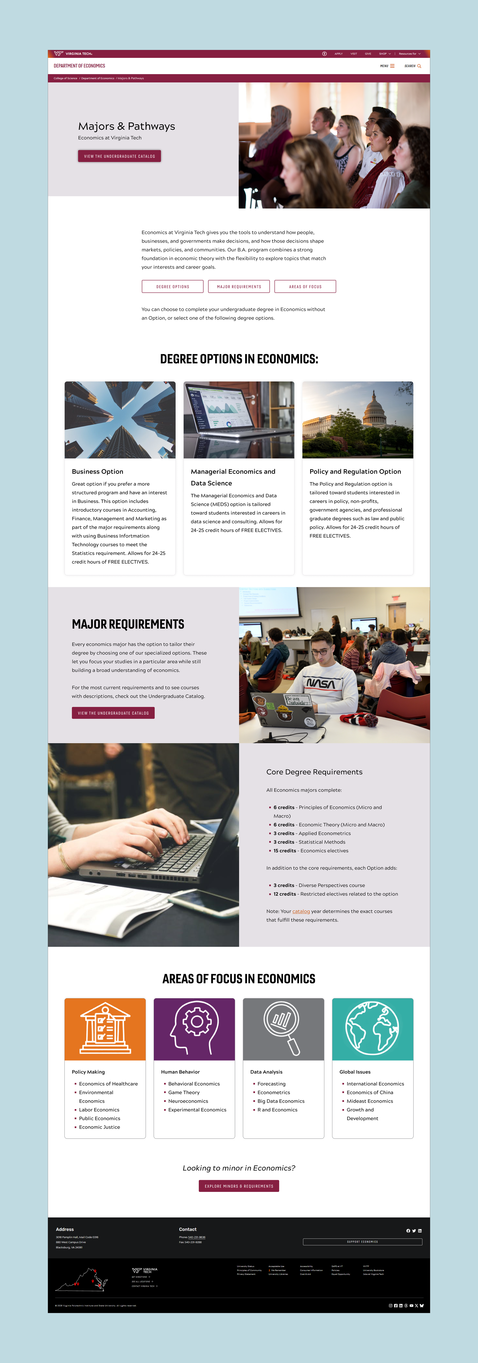
I overhauled the original Major Options & Requirements page to make degree pathways easier to understand at a glance. I carried the landing page's typographic styling into three clearly defined sections: Degree Options, Major Requirements, and Areas of Focus. New imagery helped break up dense information, and the page was renamed Majors & Pathways to better reflect its purpose.
Extending the new visual language into minors
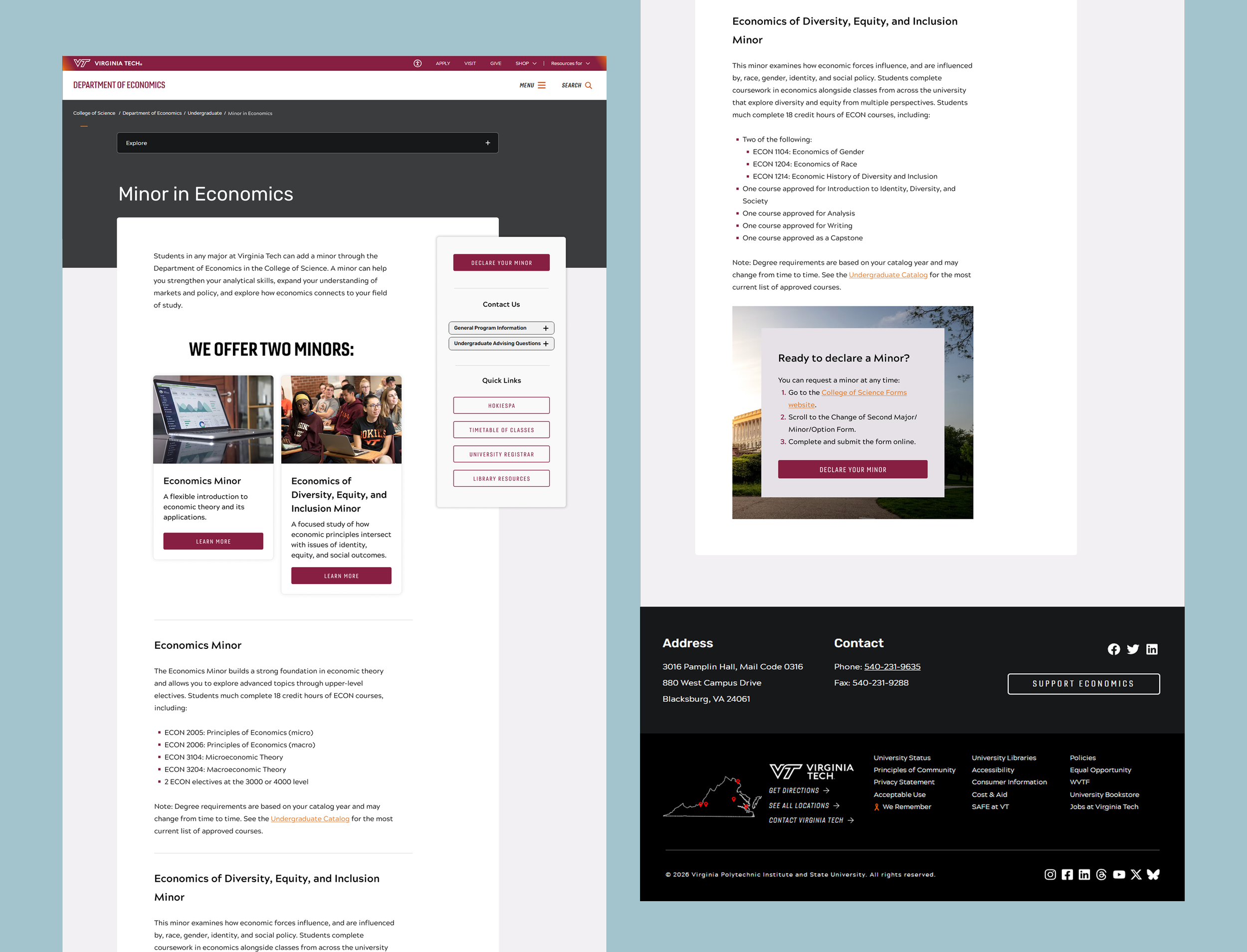
I redesigned the minors page to extend the new visual language across the site. Like the new Majors & Pathways page, I prioritized minor options near the top of the page, making them easier for students to locate.
Adding focus and function to student resources
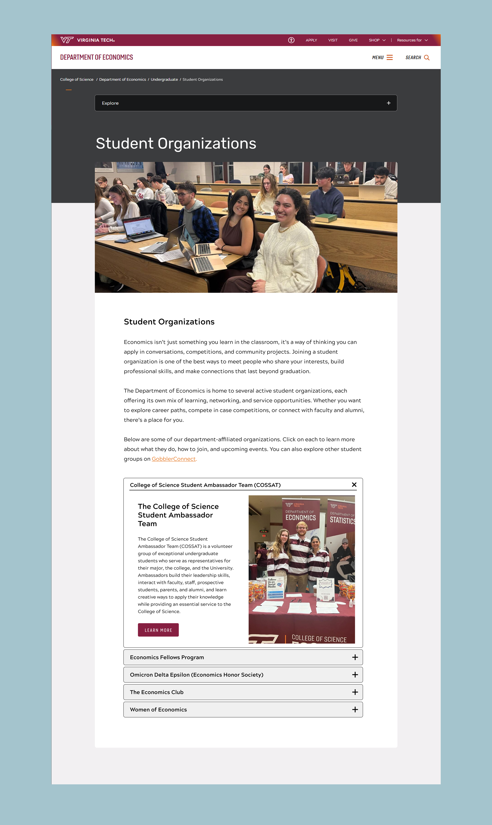
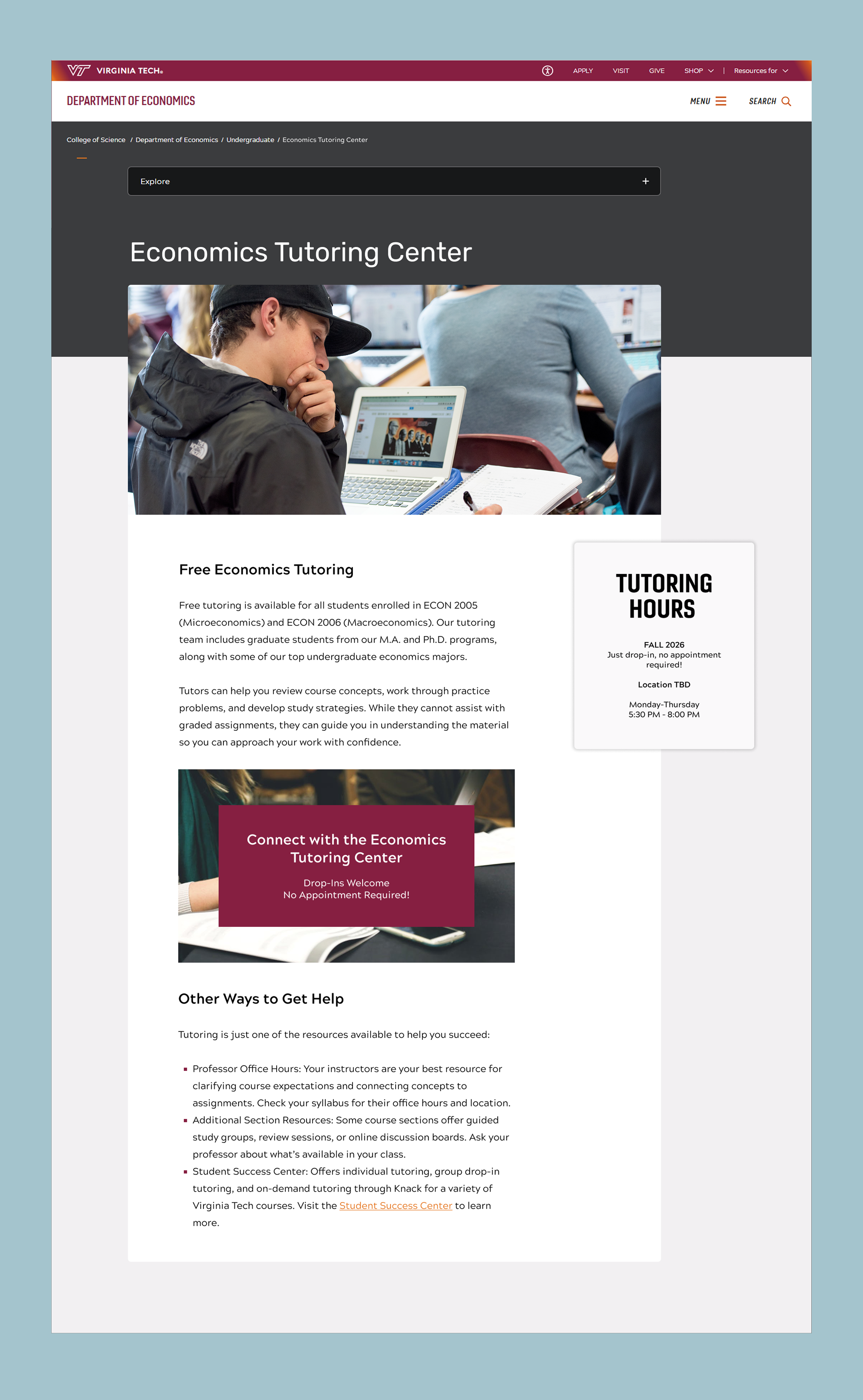
The original site design didn’t have a page for Student Organizations. I created this page as a central resource where students could explore groups and opportunities to get involved. I also redesigned the Economics Tutoring Center pages to align with the new visual system, bringing both of these resources into the new undergraduate site experience.