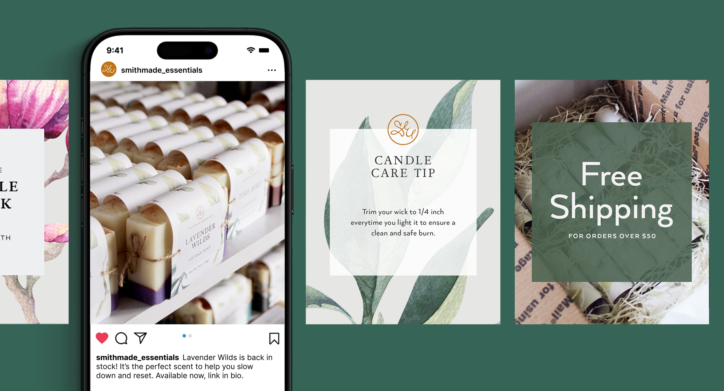
Smithmade Essentials
Packaging Design
Overview
The challenge was to design packaging that could hold up to handling, showed off the products, and was adaptable across product categories. The solution was a paper label system that used the brand’s clean aesthetic like a canvas around the products to let them shine.
My Role
Packaging Systems
Product Collection Design
Naming & Copywriting
Product Photography
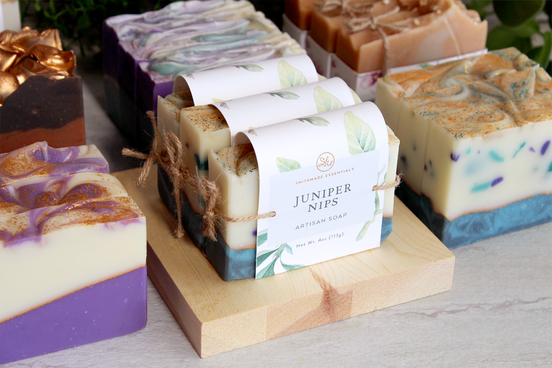
A flexible packaging system for an evolving product line
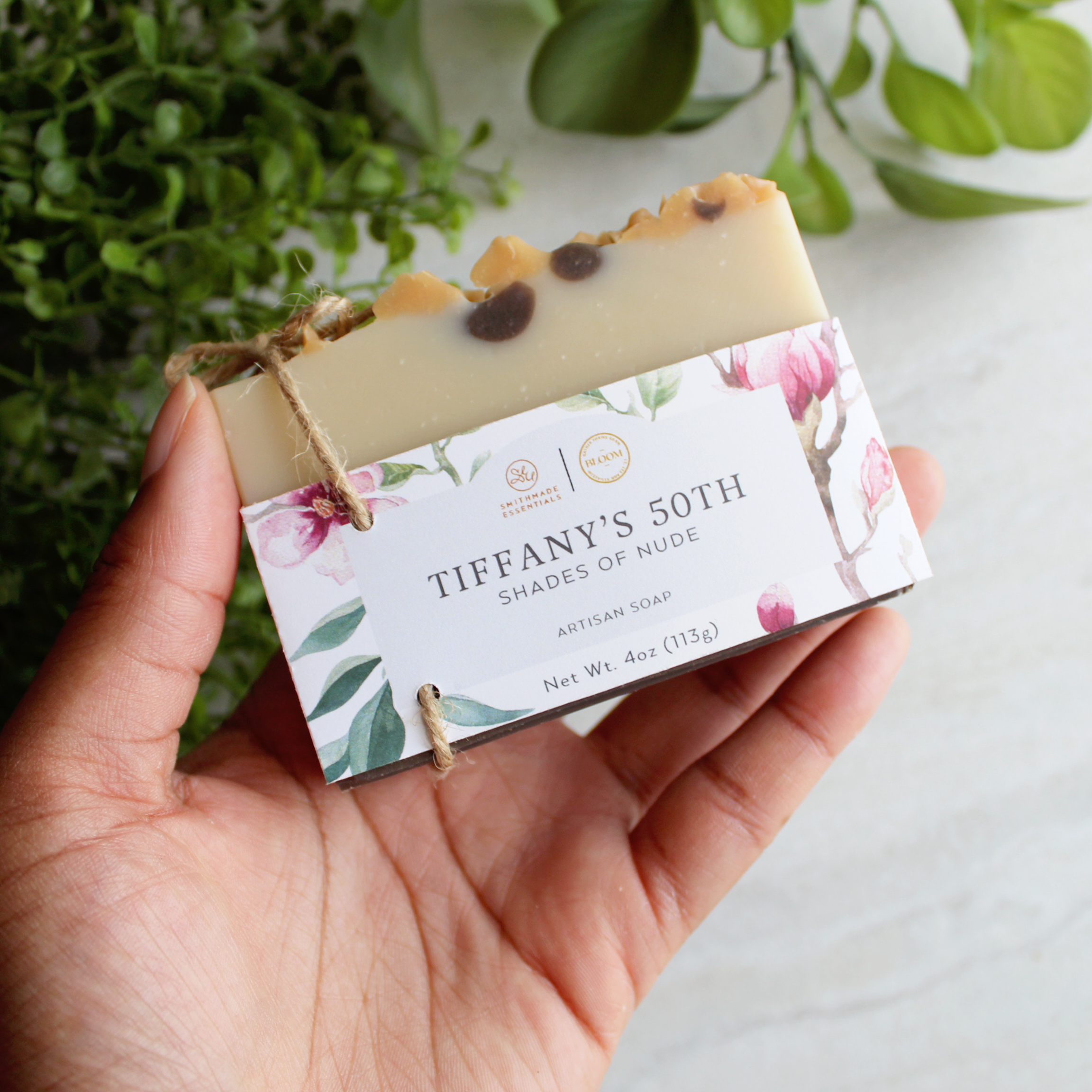
Soap Sleeve design
Artisan soap was the first product Smithmade Essentials launched in 2018. This packaging was designed to feel gift-wrapped and exude the brand’s mission to elevate an everyday item into a special experience. This design became the foundation for the packaging system that was developed with each new product release.

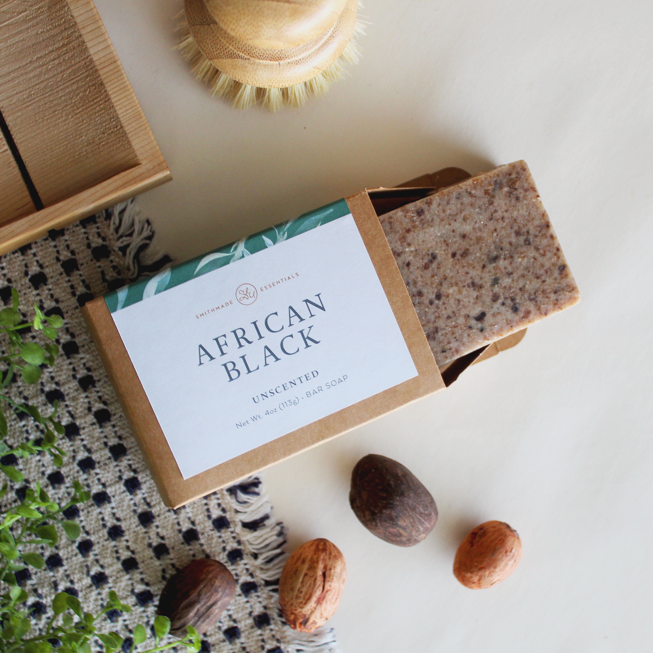

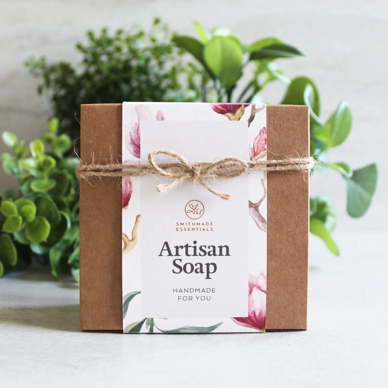

Storytelling through packaging
Themed product collections were launched seasonally. Each collection was designed to express a narrative through scent, description, and form. This strategy kept collections fresh and customers returning for each new release.
The packaging design became an extension of each collection’s theme. By maintaining a core structure to the labels, I was able to give each collection its own label design without compromising brand recognition.
Below are some of the collections that marked developments in the packaging system.
Dark Academia Collection
An autumn collection designed to capture the allure of hidden libraries, whispered confidences, and the romance of mystery. This packaging introduced new vintage styled artwork to fit the collection’s darker theme.

Dark Academia Collection
An autumn collection designed to capture the allure of hidden libraries, whispered confidences, and the romance of mystery. This packaging introduced new vintage styled artwork to fit the collection’s darker theme.
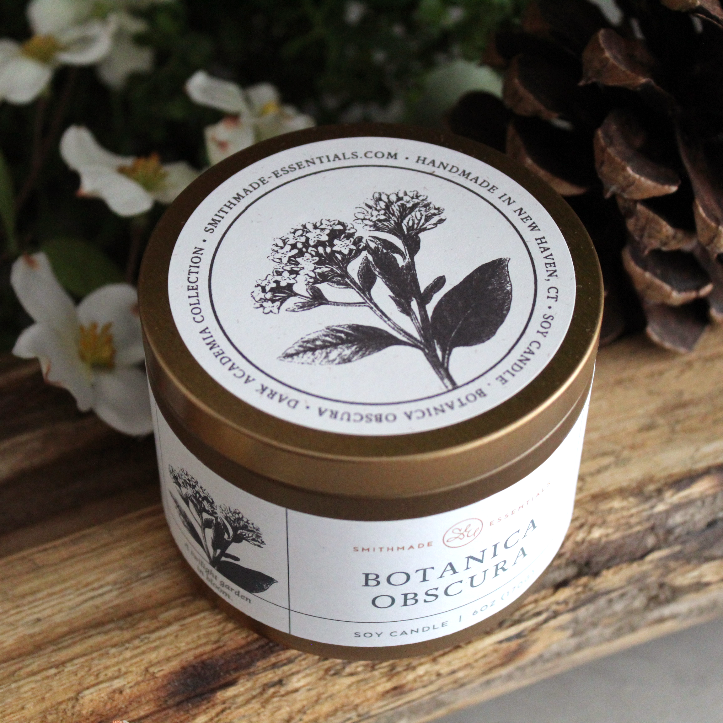
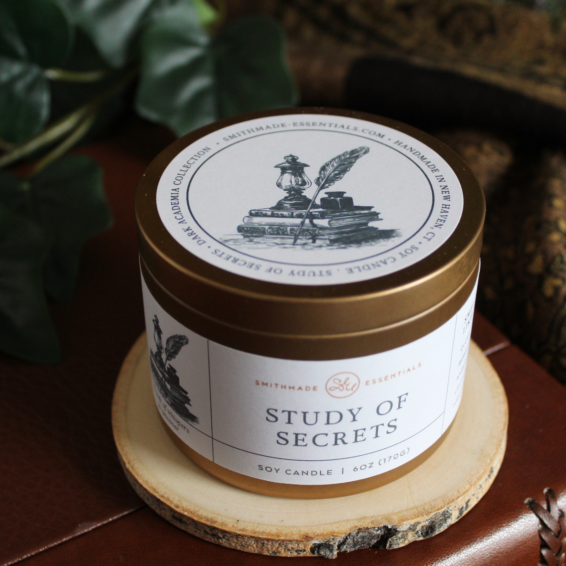
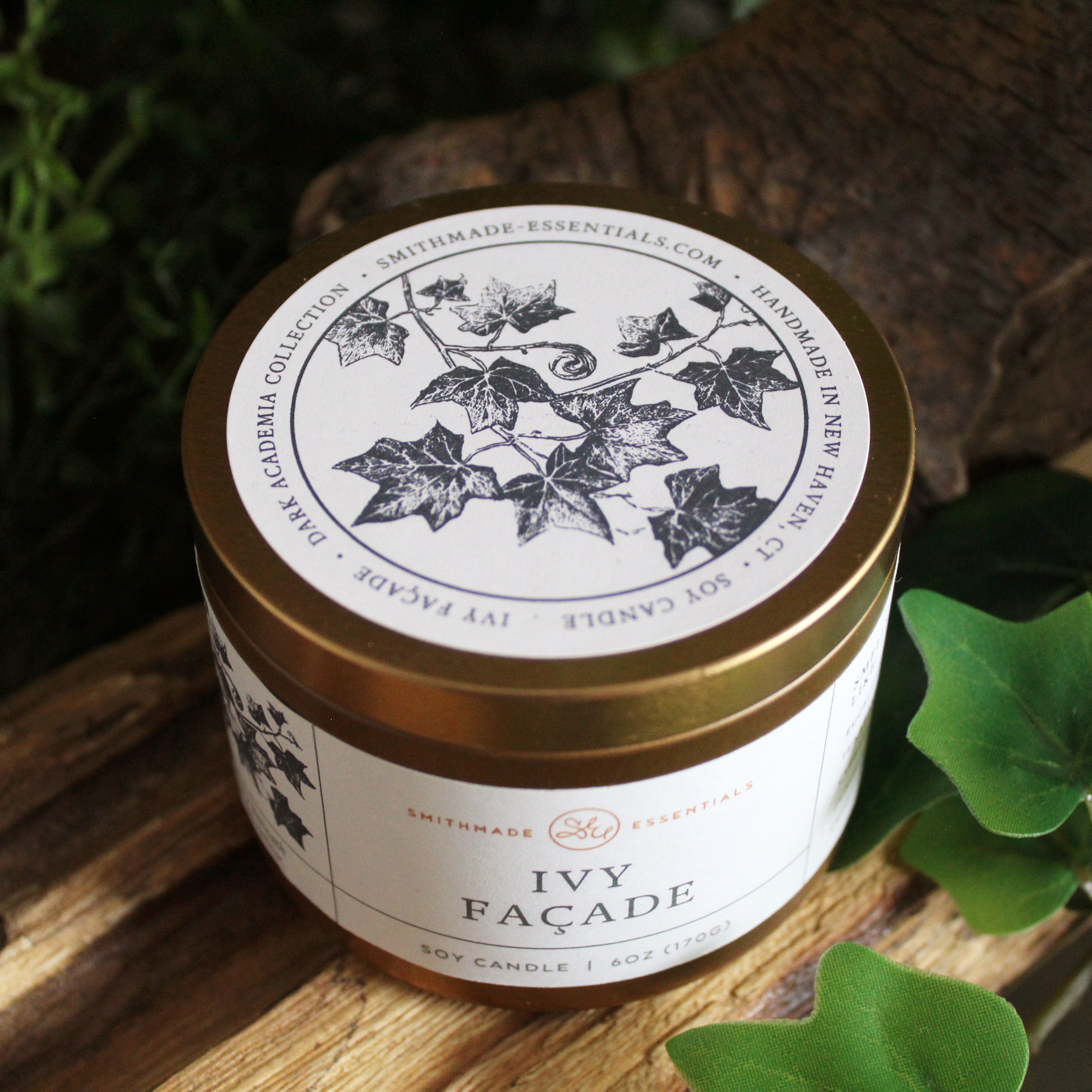
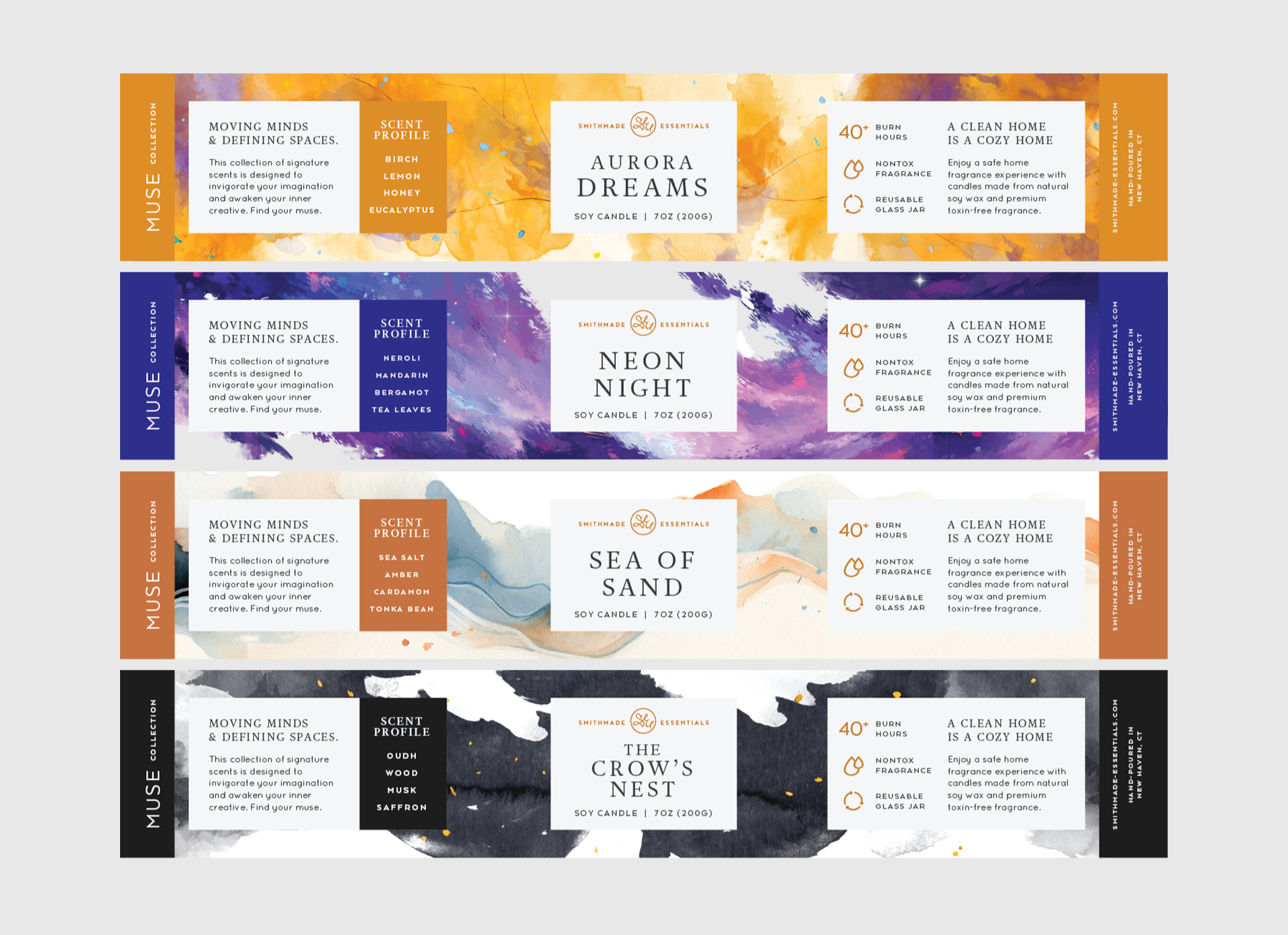
The Muse Collection
A collection built around fragrance as an element of inspiration. Each candle was given its own scent story and original artwork. The art blended watercolor and digital painting, giving each label its own unique look. This art treatment expanded the limits of the packaging system.



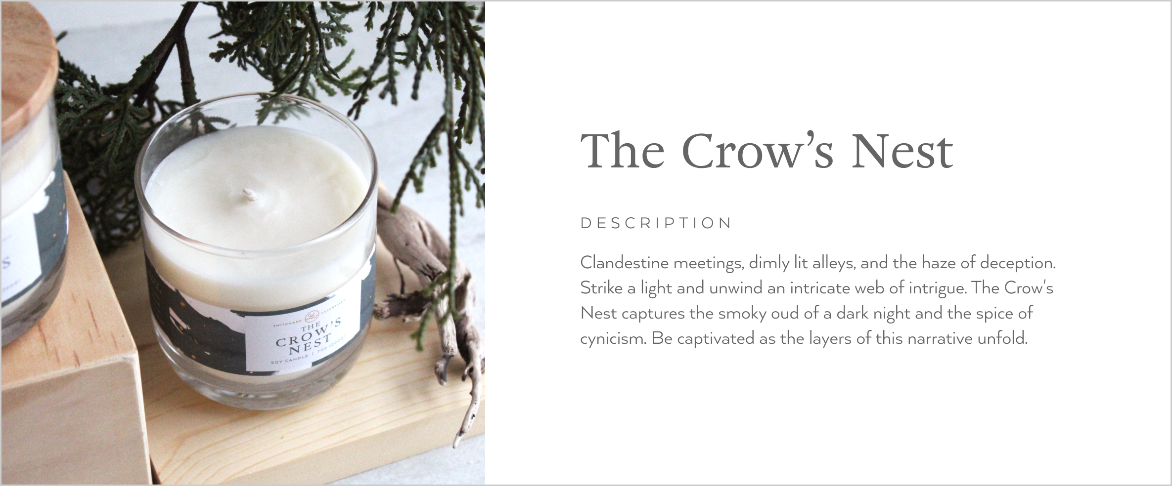
The Garden Collection
The Garden Collection was a centerpiece of the Smithmade Essentials product portfolio, featuring structural soap designs. The original vertical soap sleeve was adapted into a horizontal structure to showcase the hand-piped soap tops. This adaptation of the design became a staple and allowed for more variety in ongoing product developments.





Explore more of the
Smithmade Essentials case study.

Smithmade Essentials
Brand Identity
Smithmade Essentials
Brand Identity